Showing posts with label painting. Show all posts

Thursday, November 10, 2011

Brick House Pictures

I was pleased with the opening for my show Brick House.  Officially it started at 5:30 last Friday evening.  At about 5:45 I started to panic a bit because no one was coming by yet.  But from 6 to 8 there was a really nice steady flow of people and comments were positive.  And, if someone thought the work was awful they, thankfully, kept their thoughts to themselves.

The series features my own handmade paper on canvas.  Each brick is a separate piece of paper painted using a variety of painting techniques.  The grout texture is made by using the surface of the canvas along with modeling paste and sand swiped from the neighbor's sandbox.  What really makes these work is that I finally figured out how to use shadowing to enhance the texture of the papers.  Ah, progress!

Here are some pictures from the evening...

This picture gives you an idea of the scale of the work.  It also shows me looking better than usual.


I talked at length with a very interesting and interested lady about this piece.  It was sold in my mind.  However, this gallery at the college doesn't allow for immediate purchase and as of this minute I haven't heard from the lady.  I'm still hopeful; however, if you need to have this piece in your home it's yours for $350.

I like the size of this one and the colors turned out really nice.  I plan to use this one as my "show" piece and will finally have something to enter into the Kalamazoo Area Show this year.

Here's the entire wall, about 30 feet.  The comment I heard most often is "I want to touch this".  I say go ahead.  The texture of the handmade paper along with the various painting techniques encourage it.  I think most wanted to touch the pieces because they couldn't figure out the materials used.

This is the smallest painting, 24" x 18" but the most involved.  The patches are plaster, the bricks are handmade paper.

The show is up at the Center for New Media/KVCC (downtown Kalamazoo, across the mall from the Raddison) until the 28th of November.

Lorrie

Tuesday, November 1, 2011

Brick House - Opening on Friday

I have some exciting news!  I've been working on a series that I'm calling Brick House.  The work will be shown for the first time this month.  The opening reception is Friday, November 4 at the Center for New Media, KVCC, downtown Kalamazoo from 5:30 - 8:30.  I'll be part of Art Hop.  Come on down and take a look at my new work as well as the work of other artists showing that evening.  It's always a fun night out.


This new work is a huge step forward for me.  I really feel like I've made great artistic strides with this series as I'm incorporating handmade paper into paintings on canvas.  The handmade paper, while already very textural, actually looks dimensional because of the painting efforts with regard to shadowing and color.  The piece shown on the postcard is 24" x 24".  I will have other pieces that are bigger too.

The reception is Friday.  But, the work is up for the entire month.  I hope you'll stop by.

Lorrie

Monday, May 9, 2011

KVCC Student Show

Each year Kalamazoo Valley Community College has its annual student art show.  Well, since I'm an official student now I decided to enter.  I was juried in with my piece called Bailey Park.  I completed this painting well before I took the Painting class this semester but rules stated that the piece entered had to have been created within the last two years so it qualified.

I haven't shown it on the blog in a while so here you go...

All the colors in this photo are too "hot".  Adding it to my "Please Get a Good Photo" pile.

This 24" x 48" piece uses many of the techniques that I am hoping to explore on my own and in Art 205.  Basically, I am incorporating highly textured handmade paper into an acrylic painting on canvas.  In this case the houses are handmade paper and the background is plaster and paint.  For a look at how this was done you can begin with this post

I just completed my first ever college art class (Art 105).  Good experience, weak instructor.  I debated about continuing with another class.  KVCC has an artist-in-residence from the Netherlands right now and she visited our last class and contributed greatly.  That one experience, that took less than 45 minutes, was enough to sway me.  Yep, I'm registered for Art 205 and it starts this Thursday.

Lorrie

PS.  Our garage sale (mentioned in my last post) was a huge success.  Lots of stuff gone including piles and piles of new toys from Steve's sample room.  Still have a sleeper/sofa left as well as a nice office credenza.  Anyone?

Friday, May 6, 2011

Waiting for the Opportunity - Close Ups

Here are some close ups of Waiting for the Opportunity.  I love how the tight crops turn the piece into an abstract.  I've always been about color and texture.  With these up-close-and-personal shots you really get a look at both.

Water.  I love this.  In fact, my final for my painting class took the water idea a bit further.  I'll show you this painting soon.

If you hadn't seen the completed piece you'd never guess that this is a handmade paper fish!

This looks like a topographical map to me.  Hills, valleys, water, etc.


<><><><><><><><>
This one shows one of the handmade paper fish on the left, the painted canvas in the blue and then the raised plaster "lock". 
And back to my favorite part:  water.


Here's the finished piece again for reference on the close ups.  One of these days I'm going to actually have a good picture taken of my finished work.

We're having a garage sale this weekend.  It takes so much time and preparation.  However, since we do this every year, my husband and I have a pretty good routine down.  Nonetheless, it is exhausting.  See you again from the other side of the (hopefully empty) garage.

Lorrie

Thursday, April 28, 2011

Waiting for the Opportunity

The Artists Co-op that I belong to recently had a show opening at the Kalamazoo Nature Center.  Called Earth:  the Power and Fragility, this show had some super work from about 15 members.  So, in the middle of the basement remodel, my painting class, a trip to NY as well as interviewing for a job and ferrying the kids around, I had a show-quality (shouldn't they all be show-quality?) piece to create. 

I juried into this group as a handmade paper and paper mosaic artist so this is the type of work that I needed to make.  It felt good working with the heavily textured handmade paper again!

My idea on this theme was to highlight the plight of the Great Lakes with regard to the very invasive Asian Carp. These fish are expected to enter the Lakes via the Mississippi River and Illinois Canals.  Currently there are "zappers" in the canals that are supposed to keep the fish from entering Lake Michigan through the Locks but it is inevitable that these fish, with their voracious appetites, will get into the Lakes and alter the ecosystems.  These fish are just Waiting for the Opportunity.

Here's my progression over several days:


Back to working with handmade paper again.  Yeh!  The fish are handmade paper fish glued onto a canvas.  The chair that is supporting the canvas gives you an idea of scale.

A coat of tan paint went over the whole thing then I started to build the colors of the water.

Each fish received it's own color.  My formerly bright and fun fish had to become rather dark and menacing.  Asian Carp are not pretty fish!  The white over the blue on the right is plaster.

Continuing to layer blue on blue on blue on blue.  I used my fingers for about 90% of the water on this piece.  Very little brush work involved.

The fish get a bit of highlighting with copper paint and the Lock is put in.  The lock is more plaster so it is raised.  Lots of dimension on this piece.


The Lock is painted copper as well.

OMG!!  What happened?!?  Stay tuned...

Lorrie

PS. That is what they call a cliff hanger. :)


Friday, April 22, 2011

Art 105 - Fun Little Extras

So we move from the MOMA back to the MOMMA.  :)

In the painting class that I've been taking we use a lot of paint.  Well, we're painting so it shouldn't surprise me that we use up some paint.  However, once a color is mixed on my palette, I absolutely hate just tossing it.  So, I just started putting the leftover paint on a 9 x 12 canvas paper instead.  I didn't think, I just did.  This in itself is a good exercise as I always over think things.

I discovered that these little extras actually work fairly well because the colors are already working together in the original painting and therefore work in an abstract too.


This was made with paint left over from the collage exercise.  Should it be vertical or...


horizontal?


This one is made of leftover paint from a painting that I haven't shared yet.  Some interesting things going on here but it basically is a mess and the black is too bold.  Yet, these quickie experiments are good for this plodding artist.


Lorrie

Tuesday, April 19, 2011

MOMA

While in NYC each of us got to do one (or more things) that was special to that person. My husband wanted to see the diner that is in Seinfeld, my 16 year old wanted to eat his way through the city, my 13 year old wanted to shop, my 11 year old wanted to buy souvenirs, and I wanted to go to an art museum. Not surprisingly, the art museum idea got a luke-warm reaction from the kids; however, my youngest was quite enthralled afterall. She must have asked me at least five times: "you mean that Picasso (or whoever) really TOUCHED this painting?" She couldn't believe that we could get so close to all the work.


I promised a quick tour of the Museum of Modern Art in NYC in my last post, so here we go...

Pablo Picasso, Spanish, 1881- 1973
It was fun to watch the kids look at this one and try to figure the body parts out.

Wassily Kandinsky, Russian 1886 -1944
There were four in this series in their own room.  They are quite large.  I was taking pictures with a flash at this point and got reprimanded.  Oops.


Paul Cezanne, French, 1839 - 1906
I don't really think of the Impressionists as Modern but in reality I guess they are the ones that started it all.  Wish I knew more about art history.  I loved this one.

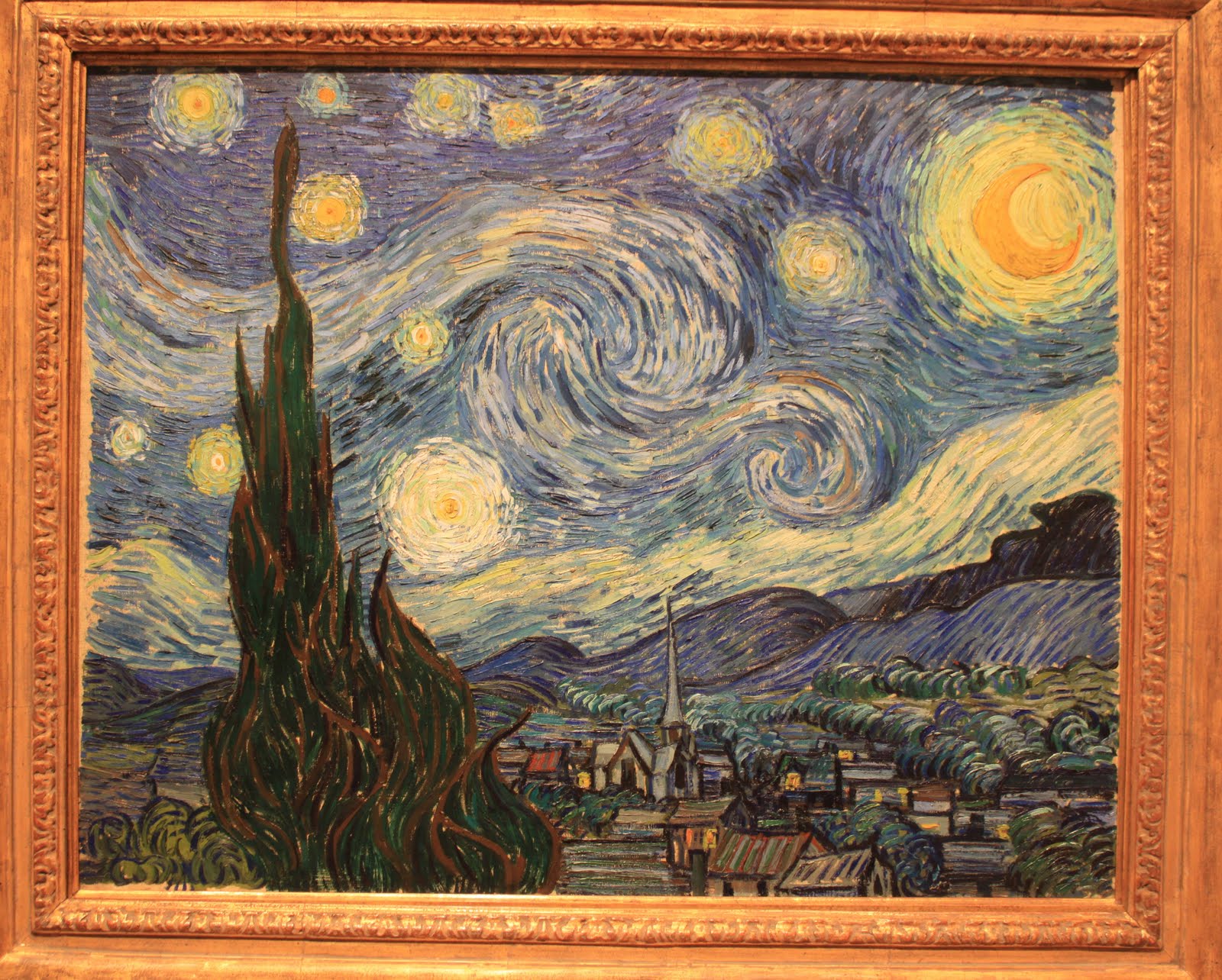
Vincent van Gogh, Dutch, 1853 - 1853
This one needs no introduction.  It's not all that impressive from a size standpoint but the brush strokes and color are stunning.


Claude Monet, French, 1840 - 1926
Ah, the water lilies.  Stunning in their size and beauty (although I did like some of his smaller paintings better).


Piet Mondrian, Dutch, 1872- 1944
I think he worked in this style/color palette most of his life.  IMO one or two or ten might be fun but then:  boring!


Andy Warhol, American, 1928 - 1987
Famous for a lot of things, here are his soup cans.  The MOMA also had his cow silk screens and a Marilyn Monroe piece.


Jackson Pollack, American 1912- 1956
I left the person on the left in this picture on purpose.  Look at the size of this!


Someone help me.  Who painted this one?


Also there were other big names like:  Max Ernst, Willem de Kooning, Edouard Manet, Robert Rauschenberg, Salvadore Dali, Paul Klee, Henri Rousseau, Mark Rothko, Joan Miro, and Rene Magritte.  The MOMA has Dali's melting watches piece and Andrew Wyeth's Christina's World, as well as many, many others that you might recognize.  I only noticed the work of one woman, Frida Kahlo.  What a shame that more women aren't big names in world of art. 


A good share of it I "didn't get" but all of it is interesting.  If you ever get the chance to go there, DO.

Lorrie

Tuesday, April 5, 2011

Art 105 - Collage Assignment Finished

As I talked about in my last post, for my painting class we had to complete a collage and then paint it. We were required to make a grid on the collage (1 inch squares on a 9 x 12 collage) and then transfer the drawing to a canvas (2 inch squares on an 18 x 24 canvas). I've not used this grid method before. Pretty easy to get a good result. In essence you stop looking at the entire piece, which can often be quite intimidating, and put it under a microscope (not literally). You draw each square as you see it. In the end you have a drawing that is darn close to the original.

We spent one entire class just mixing the colors trying to get close to the colors in the collage. This assignment was really all about mixing the colors rather than painting a cool painting. This color mixing thing is so much more challenging than I ever expected and certainly goes way beyond yellow + blue = green. Many of us were wasting lots of paint just trying to get close to the colors we needed. As a rookie, I found it helpful to use a chart that gave an idea of what colors to use to get to the desired result. If I continue with painting I will probably purchase this type of thing. It's not a color wheel, but a matrix of colors. There are books out there for this purpose too.

So here's the original collage again:


And here's my painting:


Using the two positive/two negative critique process, I think that the collage is copied really well with regard to positioning. I was very nervous about successfully painting the sofa and it turns out that I like that a lot. Most of the colors are pretty accurate. In the picture the smiling orange is quite yellow. The real thing is closer in color to the original.


On the negative side, the lavender is too dark, which is unfortunate because the phone is pretty interesting but you can't really see it because the area behind it is too dark. The teeth make the painting fun but the angle on them isn't steep enough as compared to the collage.

One interesting tidbit, after viewing the work in the class critique, it became apparent that an interesting collage doesn't necessarily make an interesting painting (and vise versa). It didn't seem to be a matter of painting talent. Curious.

Lorrie

Wednesday, March 30, 2011

Art 105 - Collage Assignment

The latest assignment for my painting class was to make three 9" x 12" collages. One of the collages would then be painted. Of course this meant that I could only choose collage images that I felt I could paint. Quite a limiting factor! :)

Collage #1:
I like the curves in this collage: the flamingos necks, the ear, the softness of the butterfly's wings, the small dots in the background. I also like the moodiness of the blue trees. This is why I didn't choose this one. I didn't feel I could capture the trees in a painting. On to the next one...


Collage #2: In contrast to the curves in #1, this one is all lines. Too boring, although probably not too difficult to paint. On to #3...


Collage #3:
Yep, this is the one. I like orange/yellow as the key color, the silly mood and the color balance. Hey, I think I can actually paint this one too. Once we picked the collage we intended to paint we had to mark it with a grid pattern. That's why there are lines on it. Wish I had scanned it prior to the grid marking it up.


Next post: Collage turned into Painting.


Lorrie

Sunday, March 27, 2011

Art 105 - Still Life Finished, Almost

Here's the follow up from my last post...


I finished the still life piece satisfactorily and handed it in. I got a good grade too. However, after having lived with it for awhile, the black bird house is bothering me. I've drawn in, with vine charcoal, the part on the black birdhouse that I want to fix. But, since I don't anticipate that "fix" being high on my priority list, you get to see it in its handed-in-but-not-finished state.


In the class critique we had to give two positives and two negatives about each students' piece. My two positives are: The red bird house decorative trim is not only painted in (I debated about leaving it off) but shadowed correctly! I really like the little tan bird house and the shadows it throws.


My two negatives are: The black bird house, as I mentioned, needs some additional work. And, The background went from being one of my favorite parts of this effort to just ok.


More to come...


Lorrie


PS. One fellow classmate suggested that it be titled "Nobody's Home". Seems about right.


PSS. I don't plan on doing any other still life paintings anytime soon.


Friday, March 25, 2011

Art 105 - Progression of a Still Life

For those of you following me because of my handmade paper art, my apologies for not having much of that type of thing on the blog lately.  Between general life with three kids, finishing the basement and my painting class the only art getting accomplished around here is for the class.  I hope you'll stick with me though as I continue to explore painting as a way to enhance my handmade paper art. 

In my last post I showed you some initial efforts for the class.  Thankfully, I'm improving.  Or, at least my efforts aren't too embarrassing for public viewing. 

Having never done a still life before I decided to record my progress as a reminder that what comes before doesn't have to remain after. I'm frequently afraid, in a good share of all of my finishing work, that I'll mess up something that is already somewhat successful. One of the biggest lessons coming from this class is that you can just paint over it. Of course, I know that in my brain. But, when you actually do it over and over, it becomes rather freeing in the heart.

This is an 18 x 24 canvas at my kitchen table (I mean easel).  A key to a good still life is the directional lighting.  Since my birdhouses were too big to fit in a box in which I could control the light easily, I found myself painting at night with one directional light to make the shadows.  This was a pretty good trick as I was able to see the shadows on the still life yet barely see what I was painting!

I drew in the objects with vine charcoal.  Great stuff as it is easily wiped off when you don't get a line right.  The perspective of most of this is fairly accurate but it took a lot of wiping off first.


Oh my, this is so brown.  The assignment required that we use only white, black, yellow ochre and magenta.  Hence, the brown.


I'm liking the ripped up wall paperish background.  Check out the shadow being cast from the little white house onto the red one.  I'm getting it, I'm getting it!


I have been trying to post this for days.  Blogger is just not cooperating with the downloads.  So, you'll have to wait til the next post to see the finished piece...


Lorrie

Monday, March 7, 2011

Art 105 - Painting

I want to get better at incorporating my handmade paper into paintings.  So, back in January I began my very first college art class.  Things that I've learned: 

 *  The aspect of my past work that I always felt fell short was shading and shadow.  My painting work is not very dimensional.  I now believe that is because I don't mix colors on a palette I just work straight out of the tube/bottle.

*  Even though my work is almost always extremely colorful I work intuitively.  Learning more about the color wheel, tinting and shading is helpful with that whole dimensional problem.

*  Having said that, I don't really like the mixing colors part of the whole thing. 

*  In this class I'm learning by doing the assignments rather than by what is taught during class time.  Expectations were too high, perhaps?  No, don't think that is it.

*  In summary, painting a decent painting is really, really, really hard.

Here are my first attempts:
Second try at a studio still life.  The first try is too embarrassing for public consumption.  We could only use burnt sienna plus black and white.  Oh no, what have I gotten myself into?

Painting from a photo.  I re-painted the foreground three times trying to make it look like flowers instead of snow.  Guess we'll just go with snow.  This assignment required that we use only black, white, magenta and yellow.  Try making a good blue or green with only those colors.  Impossible!
Here is the original photo on a beautiful, sunny August day on Washington Island, WI.  My painting looks like an overcast day on the prairies just below the mountains of Colorado.  Close enough, I say. 
I'll show you  more as I move though the semester.

Lorrie


Related Posts with Thumbnails